11.01.2010
10.08.2010

5.21.2010

.jpg)
2.jpg)


5.01.2010
Pick Me Up..... Yes Please!
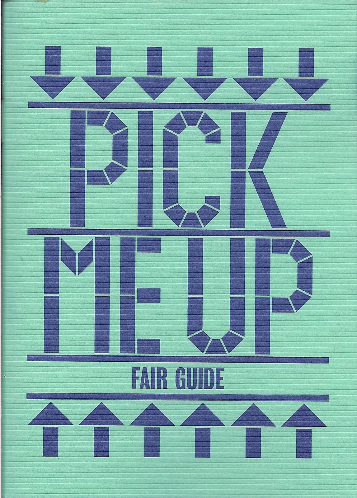
Visited the Pick Me Up exhibition today in London with a few Graphic Design buddies, was really cool exhibition so thought i should blog that shit!
Also took some photos, but not going to put them up because the work featured can be seen much clearer on the website...
I would definitely recommend this exhibition! really good day out in the big stink!
4.27.2010
4.25.2010
Nice!

Not my work, just something i liked... found on a website named Friends of Type, any budding graphic designers should have a look it's quite an interesting site!
4.13.2010

3.17.2010

3.13.2010


3.05.2010


2.12.2010

2.11.2010

Hierarchy - Alternatives


 Above is a few alternative designs i did for the brief, however i thought the black designs were more successful.
Hierarchy - FINALS


 The idea behind this brief was to get to grips with hierarchy in design, we were given 4 different sizes to work with (above) and were told to design a leaflet advertising a stage performance named Havana Rakatan that was going to take place in london. Above are my 4 final designs.


Building Blocks
 Above is one of the first major pieces of work I did at Brighton, It was for a project named 'Building Blocks' and was a poster aimed at illustrating what typography was. My crit went reasonably well, but the tutors did question why I had put the top green letters in the 'stripe' effect, which i know see wasn't such a good idea.
2.10.2010
Alzheimer's Society
For the Final Major Project in foundation i decided to create an awareness campaign for the 'Alzheimer's Society'. I started this by carrying out research into the disease and how it evolved within it's victims. At times i found the material quite dark and questioned whether i wanted to continue with such a sinister subject, however, after talking to sufferers and relatives of those who suffered i found that i was becoming intrigued by the disease and creating the images became very interesting. Through research i found that the disease is diagnosed in 4 stages. 1. Pre Dementia, 2. Early Dementia, 3. Moderate Dementia, 4. Advanced Dementia. I therefore decided that my campaign would consist around those four stages. Here is what followed...
After speaking to sufferers of the disease i found that a lot of people describe Alzheimer's as a big ball of tangled string, and ball that has no beginning and no end, no way of making sense of it the information stored becomes more and more tangled, memories being lost, new information being corrupted by older information. Alzheimer's primarily effects the brain and memory, but in later stages takes control of the majority of bodily functions, taking control of the whole brain. This idea of the ball of string provided me with strong imagery to work on. I decided to create these balls of tangled information out from tracing paper with printed information about each stage on. As the balls progressed through each stage they would become more tangled, less constructed and the information would become harder for the audience to read. With the final stage resulting in complete loss of information. visualising how the disease effects the suffers brain as they progress through the stages.
 Stage 1 - Pre Dementia
 Stage 2 - Early Dementia
 Stage 3 - Moderate Dementia
 Stage 4 - Advanced Dementia


 After constructing the balls, I placed them into these four posters, demonstrating the four stages. As each stage progresses the information within becomes harder and harder to understand, the whole concept behind this was to give the viewer an insight into how the disease effected the sufferer and an experience just a snippet of what it would be like to suffer from Alzheimer's.
After i had completed the posters the alzheimer's Society rung me and asked me whether they could use the designs in a charity event they where organising at the time. I told them to bugger off!.... no, i was very flattered an emailed them the images.

An Alternative idea/design, I did have other images in this collection, this was the most successful though.
Landscapes
The images below I created early on in foundation, the brief was named 'Distant Landscapes' and like all the other briefs was designed entirely for the fine artists and therefore made it very hard for the Graphic designers to produce any interesting work.. However i decided to take the brief in the direction of contradiction, taking certain images associated with rural or urban landscapes and contradicting them with the opposite.
 The image above is of an old farm track near to my house, In order to 'urbanise' this setting I decided that placing the traffic light strategically would create the contradiction needed. It was vital that the traffic light looked real and genuine, otherwise the whole would not work.
There were 5 images in the set, and this was the second, more of a 'visual joke' i liked the concept and idea behind this more than the final image. However i do think it turned out quite nicely.

This was an alternative idea i had for the landscapes brief. Combining Poetry that had been influenced by urban settings and an up-turned cow feeder within the same setting, unfortunately i found a lot of people did not understand what the image was, and the whole idea was lost, however i still like it!
Typography
 I started experimenting with typography early on in foundation, some of these experiments were successful, some where not! this piece is neither. for some reason i like it though, and i want this blog to be a collaboration of work i like. so thought this particular piece would be a good start. It was to represent how certain words can be contradicted by the typography used. I chose to place the word 'rural' in the typeface 'stencil - bold'.
Subscribe to:
Posts (Atom)